Sunday, April 22, 2007

[Last blog entry] Experience with " designing for UX"

Hi all,
Let me start by repeating the concept of " User Experience Design" that we mentioned in the first lecture. " User Experience" or UX is the quality of experience a person has when interacting with a specific design.
Okie, from the concept, we all know that different person will have different expectations/ needs/ feelings when interacting with a specific design, thus different person will have different experiences with the same design.
So, a question raised here is that what a designer should do to design for UX ?

Let me borrow a Chinese proverb that Mr Reddy mentioned in class. That is " Walking ten thousand miles of world is better than reading ten thousand scrolls of book". The implication of that proverb in UX design is that as a designer for UX we should go into the world of the user, stand in the user's point of view, try to understand what user wants and needs , try to predict user's emotion, etc because the UX design is ultimately for the user, not for the designer.

How can a UX designer can do that? How should a designer do to create a product for many people while different people will definitely have different tastes, needs and wants?

After doing a group project in designing a happy website, namely SHmile, I have accumulated some experiences in designing for UX. Let me share with you !
  1. Defining your target audiences ( their profile, their need and appreciation pleasure, etc) will decide your product ( theme of product, content, appearance, functionality, etc)
  2. Designing skill is very important in delivering your ideas to the audiences in asking their opinions. If you can't deliver your ideas perfectly to the users, your product won't be improved in an effective way.
  3. Users' feedback are very important. No matter what/ how users feedback about your product, please listen and value all. There is no wrong or right feedback.
  4. However, as a designer, you should have your own stand also. You can't satisfy every user. You can change this feature to satisfy user A. But what might happen if your change for user A will make user B dissatisfied ? Hence, as a designer, you should take into consideration every feedback. And at the same time, you MUST decide what change should be made based on the majority of users' opinions Plus your own stand. So, can we say designing for UX is quite intuitive in that sense?
  5. Users' experiences are very subjective and unstable. At this point of time, user A might have a very good experience / emotion/ response with your product. But at other time, such response might change. As a result, good UX design will become bad UX design. Hence, I realize that creating a channel for users to keep sending their feedbacks ( these feedbacks might be how users' needs are changed , etc) is very important in improving/ implementing and sustaining the design. For SHmile website, I suggest that our group should enable a feedback channel for the users ( through sending email to the moderator, through voting, through ranking, etc). Then, based on that, our team will have some necessary improvements to satisfy users' needs in the long run.
All in all, in designing for UX, users are placed on the top of priorities. What users want/ need/feel/, users' feedback, etc ... should all be taken into consideration. As a designer for UX, you design a specific product for users out there, not for yourself.

Sunday, April 8, 2007

Reflection on " User Research Smoke & Mirrors, Part 5: Non-Scientific User Research isn’t a Bad Thing"

There are many ways to do research in order to obtain a good design. Such research can be either scientific or non-scientific, can be either qualitative or quantitative or both. The reason is that " experience is experience, not fact" , hence every single opinion from user is considered as invaluable to improve our design.

While quantitative research allows the users to identify the trend of the users, the qualitative research offers much more information about the user experience to the designer. As a result, qualitative research allows the designer to go in to the depth of the issues, go into details of what users want/ need/ don't want/ don't need/ expect, etc, as well as go into insight of the future work.

However, no matter what kind of research methodologies that the designer adopt, users are always the last ones to decide one particular design is good or not. In other word, it is users to validate the design, not the designer him/herself. Therefore, every single feedback from the user is considered very important in improving the final product. The active users with different comments from both sides ( positive and negative) will help the designer more than the passive users who accept everything provided by the designer.

Generally, doing research is very important. We can not say which kind of research methodology is better than the other. They are complementary to each other in the reality. Hence, if time allows, the ideal method that the designer should consider is the combination of both the qualitative and quantitative research method.

Sunday, February 25, 2007

[ Nightmare assignment] Emotion design probe

In this assignment, we are supposed to improve learning experience in lecture theaters

Firstly, we need to know what experience is. Experience is not the product but it is in the interaction. And experience can be influenced by environment, time, place, other people interception, and previous experience.
Keeping that knowledge in mind, our group (including Peiting, Roger and me) decided to employ Ethnographic and interviews as our research method. The reason is that :
  • Ethnographic allows us to observe how students " interact" with the lecture theaters is dependent on time, environment around them as well as places that lecture theaters are located.
  • Interview allows us to ask respondents in-depth information about their previous experience with the lecture halls.

Based on data/ information collected from the two mentioned research methods, our group comes up with both technological and cultural solutions for improving learning experience in lecture theaters.

A/ Research methods
: Ethnographic <> and interviews ( 12 subjects in total)

B/ Findings : C= cultural solution/ T= technological solution

Technical problems
:
  • Some equipments are not user-friendly enough so that lecturer doesn't know how to use. As a results, lecture is started late --> Solution: Providing training session for lecturer ( C) or getting tech-idiots to choose the audio visual equipment themselves based on what they want/ need as well as their ability (C) . Besides, a technician may be attached to these lectures but note that it is better to teach lecturer how to fish than give him fish (T).
  • The air-conditioner is of poor temperature control. However, this issue is very subjective because it depends on each person --> Solution: Those who feel cold should bring along sweater, and those who who feel hot should wear less. ( C)
  • Low screen leads to the poor visibility by shorter students sitting in the back --> Solution: taller positioning of the screen(T).
  • Seating chairs are cramped which do not have enough leg space ---> Solution: designing seats with more leg room(T).

Student problems:
  • Bad view of screen --> Solution: tall people should just sit behind ( C) or having taller positioning of the screen(T).
  • Some students ( especially foreign students) are shy to speak up in the lecture --> Solution : cultural change ( C) or designing a real-time system in front of students which allows them to key in their questions(T)
  • Laptop charging facilities are only available at the back of the theaters --> Solution: build more power supply socket ( T)
  • Late comers are disruptive --> Solution : Building 2 level- theater like in UCC but this solution might be not feasible if money becomes the case ( T). Besides, we can impose fines on later comers but this solution might not affect the rich who are willing to pay money to come late ( C). Therefore, solution might be getting students scan their matriculation card as attendance ( T)- however, people might get their friends to help scan the card. So, fingerprint scanning sound the best option to ensure attendance ( T)
  • Loud keyboard typing sounds and talkative students --> Solutions: use of technical equipments such as soundproof headphones- those who are hygiene freaks or are feeling too rich can purchase a personal set or coax the school to change new sets every few years ( T). or lighted student seat. Lighted student sea can prevent talkative from talking personal in class by making them feel a little embarrassed ( T) . Soundproof bell allows students point out those having personal talk in class (T).
Our group designed an ideal seating chairs for students. It embodies power socket for students to charge their laptop. Under the arm rest is a remote board including soundproof headphones, control buttons for lighted student seat/ soundproof bell, and adjusting lecturers' pitch and tone, as well as language selection, etc.


Lecturers' problems:
  • Some lecturers peak in monotone/ high pitch --> Solution: using technical equipment to adjust pitch as lower pitch with varying tone have been proven more beneficial for maximal absorption ( T)
  • In the meantime, other lecturers speak too fast --> Solution: However, if we design a technology to slow down pace, what will happen is that when people reach home, you might still be in the lecture theater listening to the recorded lecture. ( T)
  • Pronunciation of English and foreign accent which makes student feel hard to listen --> Solution: Very sensitive issue , hard to improve because it depends on each lecture's effort to improve their his/her English speaking
  • Too much information in a single lecture - information overload --> Solution: Get lecturers to better manage workload and cater to students' tastes by holding surveys. Lecturers should resist temptation to impart a lifetime of knowledge in one and a half hours ( C)
  • Some lecturers are not sensitive to students' needs/ Refuse to end punctually. As a result, the students who may need to leave earlier for a next class may miss crucial things like exam tips and be deprived of a chance to listen through a lecture in its entirety --> Solution: Alerting system to let lecturers to stop lecture on time (T). Besides, performance points of lecturers might be deducted ( C)
  • Boring lecture. As a result, student might doze off --> Solution : lecturers might bring gadgets, memorize some related jokes to warm the lecture up. (C)
  • Some lecturers do not upload lecture notes beforehand/ quality of lecture note is very poor --> Solution: feedback to lectures from students ( C)
Good points of cultural solutions: 1/ Culture seems to be the root of all mentioned problems. 2/ It saves money compared to money spent on designing new technologies. 3/ Technology can be unreliable at times ( for example, headphones could spoil).

Bad points of cultural solutions: 1/ It takes a long time to implement and see changes. 2/ People can not be controlled. Even, there are some people who are too stubborn to change.

After all, our group still prefer a cultural over technical solution as tools are only as good as the user. Besides, majority of the people surveyed listed the ' interesting' level of lecturer as a good point facilitating paying attention and hence enhancing their learning experience ( the more interesting the lecture is, the easier to recall, and the easier to follow through). However, if lecturer is the case, then it all depends on the lecture which is a very subjective issue. But then again, our group realized that we could be biased about the solutions because we are students and not lecturers.

Sunday, January 28, 2007

RMA [ hand-phone benefit specification]


In the last lecture, Jermine and I worked together on constructing profile for boots users. Regarding lady boots, my observation is that women do have the sense of putting on their footwear suitable to the occasion, season and their outfit. When they go out in a chilled atmosphere, then they would definitely like to put on boots below their fur coat . Therefore, in my point of view, boots are the most common choice for women in winter other than in summer time.
Hence, I decided to build up an imaginary subject who would live in a place where there is winter.


-----------------
Profile

Cammie is 23 years old. She is currently studying at the Helsinki School of Economics (HSE),Finland. Cammie will be graduating this coming April with an B.A degree. She is very proud to be a student of HSE, which is the largest and leading business school in Finland.

As most of female students, Cammie concerns about fashion, likes shopping and loves traveling.

As the only daughter in her family, Cammie is influenced by both her parents who are very successful in the business world. Since Cammie was young, she dreamed to be a successful business woman. That's the reason why she went to HSE. Cammie studies very well and has high scholarships offered by both school and outside big companies who wish her to work for them after graduating.

Since the first year at HSE, Cammie joined in many school's activities. She thought that those activities would help her to be more confident in public- which is the first and foremost characteristic that a business woman needs to have, make new friends, and gain experiences from them. As a result, in the third year at the university, Cammie was nominated to become a spokesperson for the Young Entrepreneur Club. Cammie is very interested in delivering talk on behalf of the club to attract new members to the Club. She loves the feelings of standing in front of new faces and sharing experiences with them. Many students at school knows Cammie who is not only good at studying but also charming and professional looking.

As the only daughter in a family in which her parents often go overseas for business trip, Cammie raises 2 puppies to make her house less empty. She considers them as brothers and sisters, and always feeds them on time. She often takes them out when she goes jogging.

Cammie is received a lot of care from parents. She loved her parents so much. She's studied music since she was 5 years old. Cammie could play organ and sing very well. With other 4 friends, they form a band namely "Snow" in which Cammie is a singer. The music line that " Snow" choose is Pop. Cammie often spares her scholarship to buy performance clothings. At weekend, Cammie and her band often meet each other. Sometimes, they go shopping to choose performance clothings. At other times, they gather to rehearse for a performance. And always , when they are free from studying, they go to parties together, sing songs, and dance.

Cammie is always aware of what she should do for her family as a filial daughter. She tries to balance time for friends at school, her band and entrepreneur club, family as well as keep her study record always on the top.

Four-pleasure Analysis :

1. Physio- pleasure :
  • As a spokesperson for the Young Entrepreneur Club, standing in front of many people and delivering speech, Cammie is aware of keeping her looking in-shape : Need- pleasure
  • Jogging keeps Cammie fit and in-shape : Need-pleasure
  • Many people at school knows Cammie, therefore keeping smiles on her face become a habit of Cammie when she meets people : Appreciation-pleasure
  • To be a singer in a music band requires Cammie to change her clothing style a little bit when she's on stage. Therefore, when standing on stage, Cammie allows herself to wear fashionable clothes than the ordinary days: Need- pleasure
2. Socio-pleasure :
  • To prepare to become a successful business woman in the future, Cammie pratises herself to be more confident, more professional speaking by joining many school's activities: Need-pleasure
  • As the only daughter in her family, Cammie basic social needs are to be loved and be shared , otherwise she feel very lonely. For her, relations with parents and friends at school are very important: Need-pleasure
  • Cammie loves the active lifestyle that she is leading and takes a secret pleasure in the status associate with it. Therefore, she loves socializing with people. She loves the feelings of standing in front of people, smiling with them, talking to them, and sharing experiences with them: Appreciation pleasure
3. Psycho – pleasure
  • Cammie loves family life, doesn't dare to stay alone. Caring puppies make her feel happy and less lonely: Appreciation pleasure
  • Cammie can play organ and sing very well- she derives a sense of a typical girl who loves anything beautiful, and who is musically inclined: Appreciation-pleasure
4. Ideo-pleasure
  • Cammie has a sophisticated lifestyle. She feels herself as a real business woman when she delivers a talk professionally. At the same time, she feels herself as an artist who can play music and sing very well: Appreciation-pleasure
  • To be known by many people at school as an outstanding student, Cammie's long-term goal is to try even more to keep such perceptions of others about her: Need-pleasure
  • To prepare to become a business woman in the future, Cammie leads an independent life. She uses her scholarships to buy performance clothing instead of asking her parents: Need-pleasure

Physio

Socio

Psycho

Ideo

Staying in shape

Belonging feeling

Caring

Active

Flexible in clothes style

Good relationships with others

Sense of achievement

Independent

Professional looking/ Friendly/ Active/ Charming

Status/ Image


Ambitious


Hand-phone Benefit Specification:

A hand-phone for Cammie should have the following pleasures:

1. Physio- pleasure
  • The color of charming beauty. Therefore, the phone's cover should be in light color. It should have decent looking - Need
  • Professional appearance - Appreciation
  • Small and comfortable because Cammie is very active person so she maybe like something easy and small to carry - Need
2. Socio- pleasure
  • Cammie loves socializing with people. She has good relationships with many people. Therefore, a hand-phone with function of surfing the Internet, storing as many numbers as possible will help her to facilitate social interaction, or improve relationship - Need
  • Be well known in school as a spokesperson for Entrepreneur Club and a singer in " Snow" band, a hand-phone which is not really popular may be Cammie's choice. The reason is that it will help Cammie to show her own identities - Appreciation
3. Psycho-pleasure
  • Cammie is quite busy with both studying and joining school activities. Therefore, an user-friendly hand-phone will be considered. For example, a hand-phone which is equipped with intelligent t9 typing, definitely will allow Cammie to easily type text messages without pressing each key upto 4 times for the correct letter - Need
4. Ideo-pleasure
  • Cammie is a type of person who has great passion for arts. Therefore, a hand-phone with special design may attract her- Need
  • With charming looking, Cammie might prefer a hand-phone with girlish looking ( shape, decoration,etc) - Need

Based on all mentioned above , I decided to choose Fly Z500 for Cammie


Here are some previews of Fly Z500
  • Color: White- light charming color
  • Decent looking: compact powder shape which looks very girlish and professional
  • The Fly Z500 is capable of surfing the Internet with the built in browser of the phone. With this phone, you may also send MMS, or Multimedia Message Service. The phone is also able to use EMS, or Enhanced Message Service. On top of sending messages, the Fly Z500 is equipped with intelligent t9 typing, which allows you to easily type text messages without pressing each key upto 4 times for the correct letter.

    The Fly Z500 comes fully equipped with a WAP browser, and additionally an HTML browser for normal web page surfing.. including support for java.

  • Memory: Phonebook 300 names, for each you can enter up to 4 numbers, e-mail address, you can assign a user to one of 7 groups, assign a call melody and a photo or a picture. You can keep up to 140 SMS

Source: http://www.canadiancontent.net/mobile/Fly_Z500.html
http://www.mobile-review.com/phonemodels/fly/fly-z500-en.shtml

Sunday, January 21, 2007

[Pleasure with products] What man devised that he might see

All products have multiple dimensions on which they need to be evaluated. According to the " Emotional Design" book by Donald Norman, different dimensions of a product are identified with different levels of processing by people: visceral, behavioral, and reflective.
These three levels translate into three different kinds of design.They are:
  1. Visceral design refers primarily to that initial impact, to its appearance.
  2. Behavioral design is about look and feel -- the total experience of using a product.
  3. Reflection design is about ones thoughts afterwards, how it makes one feel, the image it portrays, the message it tells others about the owner's taste.
I will use three models of eyeglasses as examples of visceral, behavioral and reflective design.

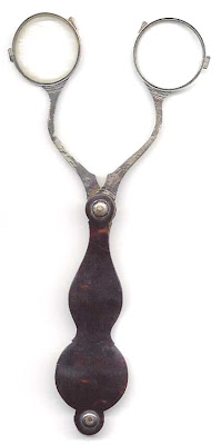
Eyeglasses # 1: Scissors glasses

George Adams, Fleet Street London, patented scissor glasses in 1780

1.Visceral:
  • Crude design of the old times, like a scissor. The glasses look cumbersome.
2.Behavioral :
  • Very weary to handle, not really comfortable to bring along. Let's imagine what will happen when we use scissor glasses to read book, or to hang out with friends? One hand is always needed to hold the glasses , which will definitely make our hands feel very weary .
3.Reflective:
  • This product should have used when there were no other better glasses for people to choose. In the present day, scissor glasses can not be used in daily life for the convenience of the users who prefer small and comfortable products. Instead, it is purchased by museums , or by antique collectors.

Eyeglasses #2: Pierced eyeglasses

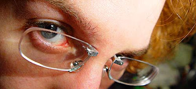
Created by artist James Sooy (http://www.jamessooy.com) and Oliver Gibson

Here's the step-by-step:
  • Get pierced- an internally-threaded barbell that goes through the skin above the bridge of your nose.
  • Use a tabletop mill to cut the L-shaped metal pieces that screw onto the barbell
  • Attach rare earth magnets to the glasses; these hold the glasses on.
  • Don't get rid of the bridge pieces; they let the lenses sit on your nose and take the actual weight of the lenses.


1. Visceral:
  • Innovative
  • Attractive to some who like piercings.
  • Looks more painful than cool. Even, for some it is disgusting. They asked a question of what will happen if the users forget that it is attached to their nose and accidentally snatch it quickly. Some gave ironic comments by saying that "Maybe I could pierce a pen to my finger, or even a toothbrush to my lip and ear".
2. Behavioral: According to James Sooy,
  • Bridge piercings doesn't hurt. His piercing was painless due to the fact there were few nerves between the eyes, although, some people have more than others. The piercing actually never touches bone or cartilage, which is a common misconception.
  • Wearing pierced glasses doesn't hurt. Actually, because they have no frames there isn't anything rubbing on the ears, which means they can be even more comfortable than normal glasses.
  • All the weight is applied to the nose pads, making pierced glasses feel exactly like normal glasses on your face. As the lenses are held by magnets they can easily be removed before bed too.
  • Overall, it is safe to wear pierced eyeglasses.
3. Reflective
  • Self-image, show off
  • It is suitable for those who are scared of LASIK surgery. According to James Sooy, " Paying two thousand dollars to have someone cut your eyes and shoot a laser in them ( just so you don't have to wear glasses) seems extreme to me..." Moreover, it is suitable for those who have time and budget limited to undergo eye surgery, yet don't want to be sticked with glasses, because the frame of pierced eyeglasses is $75-$100 US, which is about the same as regular frames.
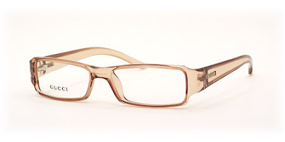
Eyeglasses #3: Gucci eyeglasses Model GG 1438

1. Visceral:
  • Beige color is easily to match with clothing
  • Looks delicate
  • Suitable for ladies
2. Behavioral:
  • Of course, compared to scissor glasses, this product is easier to handle and more comfortable, more fashionable.
3. Reflective:
  • Gucci eyeglasses are prestigious brand name. Therefore, wearing this product helps the owners to obtain the status symbol ( which will help to define their status in society), self-image and show off.

Monday, January 15, 2007

[Warm up exercise] Bad Design


A product that receives bad quality of experience from users can not be a good design!

iTunes Store

Why did I choose iTunes as the bad design?
Firstly, I'd like to give you some ideas about iTunes, and its basic features. iTunes is known as a digital media player which is very much like Windows Media Player ( WMP). It was first introduced by Apple Inc. in January , 2001 for playing and organizing digital music and video files. Because iTunes is introduced by Apple, it is widely known as a service going along with Apple products, such as Apple iPod. It's very hard to compare iTunes and WMP because it depends on the customers' demands. However, overall iTunes offers end-users with a bunch of features. To name a few, they are:
1. iTunes Store: allow users to download purchased digital music, music videos, television shows, iPod games and feature lengh films.
2. Playlists : " Smart playlists" are playlists that can be set to automatically updated based on customer' options.
3. Music library: a virtual library allowing users to import and export songs, acess and edit a song's attributes.
4. File format support: read, write, and convert between MP3, WMA, AIFF, WAV, MPEG-4, AAC.
5. Printing: print song lists, and album lists.
6. Plugins: ( very much like WMP) allows users to create music-driven visual displays

7. Podcasting
8. Synchronizing iPod: iTunes can automatically synchronize its music and video library with an iPod everytime it is connected. New songs and playlists are automatically copied to the iPod and songs that have been deleted from the library on the computer are also deleted from the iPod. Automatic synchronization can be turned off in favor of manually copying individual songs according to users' preferences. iTunes supports only copying music to the iPod but not from it.

etc...

However, sometimes "the best ideas are the simplest ideas". A lot of features accidentally turned iTunes into the bad design and stole the user-friendliness of the product.

User Reaction
I chose two people for the reflection of the product. One never used iTunes before, and the other one has used iTunes for 5 months ( she bought her first iPod in September, 2006). The reason I chose two kinds of users was to test the user-friendliness and the design of iTunes.
  1. New user: She looked impatient when she tried to open iTunes. She kept double- clicking on iTunes icon until the interface of iTunes appeared on the computer screen. She felt annoyed when clicking on some buttons under LIBRARY ( Music, Movies, etc) because it took time to load those programs. For her, WMP and iTunes are merely tools of playing and organizing music, therefore why we don't use WMP instead of iTunes. She kept asking me about all the features of iTunes. Then, she wanted to show me one of her favorite song. Her song happened to be in wma file. When she right-clicked to choose playing that song with iTunes, that song couldn't play. She tried with another song in mp3, that song played. She said all her songs in spite of their formats ( wma or mp3) can be played with WMP. Generally, for her, iTunes is very slow to open, not user-friendly to new users compared to WMP.
  2. Current user : Here are her feedbacks after using iTunes in 5 months
  • Bad #1:Not user-friendly :She admited that she spent the whole evening learning how to use iTunes, and how to export music from iTunes to iPod.
  • Bad #2 : Causing computer hang : iTunes software is quite big. Therefore, whenever she opens it, her computer ( IBM T43, RAM: 2 dimm, each with 512 MB) is slowed down. Sometimes, her computer is hung for a while if she opens many programs at the same time.
  • Bad # 3 : iTunes can read some file formats only ( as mentioned earlier). Therefore, it takes time for iTunes to convert songs from wma format into AAC format. Her music folder is around 10 GB with many songs in wma format. Therefore, she couldn't stand iTunes when it converted all those songs into AAC format. Frankly speaking, she said time for iTunes to convert individual song is quite fast. But to convert a big amount of songs in wma format, it really slows down her computer. She admitted that she gave up so many times by stopping the converting process. As a result, another problem came out. Next time when she chose to export some musics into iTunes, the same process of converting happened, which created duplicated songs ( Songs are converted twice. You can see some songs are duplicated in the picture below). For her, it is a flaw of iTunes in a sense that it can't recognize those songs that have already been converted.
  • Bad #4 : It is very time-consuming to arrange music folder manually. Her iPod has a capacity of 2GB, whereas her music in total is 10GB. Therefore, she had to choose songs which she wanted to sync to iPod manually. Otherwise, iTunes will inform that the music in the library exceeds the capacity of iPod. As a result, no single music is copied into iPod.
  • Bad #5 : Synchronizing iPod causes troubles sometimes. She told me about her bad experience with iTunes. Her iPod used to run out of battery when she didn't bring her laptop along. Therefore, she had to use her friend's computer to charge ( by downloading iTunes into her friend's computer). Because she didn't notice of the automatic update function of iTunes , all her music in iPod went out by updating the empty music folder ( which is on his friend's computer).
All in all, she complained about flaws and complicatedness of iTunes.

After interacting with iTunes, both new user and current user agreed that iTunes is not user-friendly enough. As a result, for the current user, she only uses iTunes when charging her iPod , and most of the time she still uses WMP for playing music. Lesson learnt here is that user-friendliness is one of the determinant factors for users to adopt a particular product. In terms of brand name, both are aware of the service offered by Apple.

My reflection:

I used to undergo what the new user experienced. And I have the same thoughts of the current user after using iTunes for nearly a year. Moreover, I have a very bad experience with iTunes. That time my computer was affected with viruses or something that I was not really sure. As a result, it made my computer very slow. However, I still tried to charge my iPod when my computer was very slow. What happened was that iTunes seemed unable to open, iTunes couldn't recognize iPod. However, the charging was still completed. But when I touched on the iPod , it got shock , which was very scared. I would say fairly that the iPod got shock was not due to iTunes. However, based on the 2 reactions I got from friends ( new user and current user) and based on my bad experience with iTunes, I would say iTunes is not really as a good design as people often boast . Instead, it is really a BAD DESIGN to some extent.

My very first ever entry


Hi everyone !

Welcome to my little house of NM4210. I created this blog for the purpose of posing assignments and all things related to the ' User Experience Design' module. Your comments will make my blog more fun and interesting ^_^